Pages

Sunday, 31 August 2008

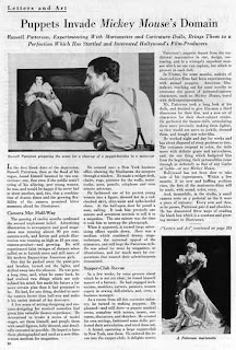
Puppet invasion

Here's an article I just scanned for the Russell Patterson blog.

A version you'll be able read (as opposed to this low res version) can be found here.

BTW: Photoshop is driving me nuts at the moment.
Anyone who knows how to make the eyedropper tool select the foreground color automatically?
I know that I can use alt. when picking up color to make it a foreground color or use the x to switch colors. But what shall I do to make it pick up foreground color right away, without having to do some extra clicking?
Aaaargh, frustrating!!!

Friday, 29 August 2008

Snuffys giraffe

Since it's now official that my girlfriend dislikes donkeys in comic strip originals by Dick Moores I bought this:

I really hope she likes DeBecks giraffes more...

OKMNX!
/Joakim.

PS. Is this DeBeck or Lasswell artwork? Or both?
Guess Lasswell was assisting on both the dailies and the sundays by 1940?

X-tra PS.
Anyone got Barney Google sunday tearsheets or dailies from the 30's to ca 1943 for sale? Let me know.

Monday, 25 August 2008

Jungle Love


King Kong's little brother seems to be getting a trifle too affectionate. In the picture are the famed cartoonist Chic Young, who draws "Blondie", Lyman Young, who conducts "Tim Tyler" to the ends of the earth and Otto Soglow, author of "The Ambassador" goings-on. The scene is "Through the Lost River" at the World's Fair.
[July 7, 1934]

Niiihaaa!

Did you know that 98.99% of the female population doesn't find a 1942 Jim Hardy daily with a donkey an attractive livingroom piece? Astounding, isn't it.

Model on couch: Hedvig
Original art: Dick Moores
Donkey: Joakim

Sunday, 24 August 2008

Vixiearts version

And here is my girlfriend's version of the same photo. I feel like crawling under a rock never to be seen again when comparing my drawing to hers...
For more of her stuff check out her blog.

Saturday, 23 August 2008

Mosh

Here's a brush drawing I made today for the Mosh Drawing Jam over at the Drawingboard.
From a photo by Stuntkid.

Thursday, 21 August 2008

Russell Patterson blog


I just started a Russell Patterson blog.
You can find it at http://artofrussellpatterson.blogspot.com

The blog is open for everyone, meaning that if you got a Russell Patterson cover, illustration, photo or if you own a nice original etc that you want to share you are more than welcome to do so. (No scans from the Fantagraphics book allowed! I encourage all to buy the book instead!)
Just log in with pattersonblog and russellpatterson1 to post and write. Please use the labels function to make the blog searchable. 

I'll add some of the stuff I've posted here before I start to scan and add new stuff. 
Hopefully this new blog will mean that all of us Russell Patterson fans will see "new" and rare artwork by his pen. 

Monday, 18 August 2008

Gradients and coloring

Nowdays there seems to be more and more gradients used when coloring comics and comic book covers. Nothing wrong with that if done with a feeling for the tool and understanding of light and shadow and color in general. And if the artwork is created to work with a ton of gradients like some superhero comics are there is absolutely nothing wrong with it.
Good coloring is always about adding something to the image without distracting from it. It shall be there almost without being noticed. Like a good sundtrack to a movie.

But when I see a bad coloring job destroying a wonderful piece of artwork it's always a bit disappointing. And irritatiing because I know that it could have looked so much better.
Let me show you some examples.
(And I should add that I'm using some Disney comics as examples just because they clearly show my points and because I have them at hand in my studio. I'm not saying that these are the worst or best examples. It could just as well have been illustrated with Woody Woodpecker comics if I had any of those here. I'm using these images just to get my points across. )

This example comes from a Uncle Scrooge comics drawn by Daniel Branca. First I have isolated his black and white line art so you can see it the way he drew it.

Then we have the scandinavian coloring. Just flat tones. The artists lines is speaking and the coloring is there like the soundtrack mentioned above. No indications of light more than the shadow beneath Scrooge. No distracting elements in the panel. We read the balloon and moves on to the next panel. Artwork, coloring and text in sync.

Then we have the US version of the same panel. Here every area has a gradient.
There is no focus and no reason. Just try to find the light source in the panel.
Branca drew a shadow but in this panel there seems to be one light source where the wall meet the floor, one beneath Scrooges beak and one above, one to the left thats shining on the object to the right etc.
There's just no afterthought or reason. The more gradients the better seems to have been the motto.
But sometime less is more I believe...

Our next panel from that story shows a bump. One version where the artwork tells the story and yet another where the color tries to add something unneccesary. (A green sky over a desert?)


Our third example is yet another idea about coloring and gradients. Thake a look at then second panel of the two.
Gradients and colors in the balloons??? The idea sounds bad and in my opinion it turned out bad too. Again: if there's no reason for a gradient why do it?


Next we have some covers. I've touched this subject before, see the post for March 3, 2008.
I have the same feelings for the two covers seen below as I have for the US Scrooge panels above. Looks like the colorist tries to add a "horizon" where the artist did none. (And I think the actual horizon line has been added to the Bolivar cover since there are versions without it.)
I believe that all of the covers below has been designed and drawn with the idea that the characters should stand out with one monochrome background color backing them up.


Compare the two first above with the two american covers below (drawn by Daan Jippes).


See how much clearer they are? The focus is on the gag and the artwork. Shadows has carefully been added to the areas where they are needed. A beautiful coloring job that I unfortunately have no idea who did.
The same goes for the cover below.

Just look at how carefully the shadows and highlights has been applied. This coloring job is also filled with different gradients and "shadow colors" but is the direct opposite of the Scrooge panels above. This colorist is aware of what he or she is doing and applies his/her skills to the artwork without destroying it. Instead the combination of the two becomes greater than the parts IMO.
Remember what I wrote in te beginning? "Good coloring is always about adding something to the image without distracting from it." And thats exactly what's done here and on the two MM and US covers above.

But maybe I'm totally wrong? Let me know your opinions!

To round off this post I just have one more cover for those of you who thinks gradients and horizons are neccesary to make a successful cover.

Nice, eh? ;)
Sunday, 17 August 2008

Mickey and Johnny

Are Myklebust alerted me on this publication that just sold on Swedish Tradera.


It's from 1936 and is titled Musse Piggs Julafton (Mickey Mouse's Christmas).
Published by Åhlen & Åkerlunds Förlag in Stockholm. 16 pages and A5 size. I've never seen this publication before. Probably a real rarity. Was there any American edition of this or was it locally produced here in Scandinavia?

And Karl-Erik Lindkvist recently mailed me a photo of his two beautiful Johnny Hazard strips that I just have to share with you. These are from 1968. Far from his peak period but from when he drew the strips larger again. A really nice pair of dailies.
(And I'm still looking for a nice Robbins daily myself...)

Monday, 11 August 2008

Hedvig interviewed

I'll be away for a few days now (Ah, sweet vacation time.) but before I leave the studio I just have to post this new mini-interview with Hedvig, published in TL-magasinet last week. (In Swedish)

Coming up next month is "Tjejsnack", the first book she has illustrated!

Also: Check out her brand new blog! Just click on her name in the list of Swedish artists to the right!
You'll find plenty of new illustrations and stuff there. Including this selfportrait. :)

Go check it out!

Sunday, 10 August 2008

Uncle Scrooge 64


The cover of US 64 was brought to my attention today. And looking closely at it I wonder if not the backgrounds has been drawn by someone else than Barks. The inking doesn't match his and the lines are overlapping. So I scanned and quickly recolored just to see what it looked like without them. And... hmm I see why the background was added. Or maybe Barks just used another pen/style when he did those backgrounds. Now I begin to doubt myself. :)
Feels kind of empty and unbalanced whitout them, don't you think? Also notice how nice the text balances the composition.

Browsing inducks (coa) I noticed how many variations the cover had. Not only in color but there are some redrawn versions as well. And notice that the Uncle Scrooge Adventures reprint has deleted the gems that Scrooge throws away. Odd since those are clearly drawn by Barks. Maybe the editor felt that it was uncharacteristic of Scrooge to throw away riches?
Wich my favourite is? Without any doubt the original. The flat background color that puts emphasis on the ducks. I love the monocrome coloring that makes the characters stand out. The redrawn versions isn't half as good as the original but maybe the publishers lacked the proofs for Barks art.


I was actually gonna do a post about covers with vs without horizons and with vs without gradients. But it will have to wait.
Gotta run.
/J.