Monday 31 March 2008

Some Raymond stuff

Yikes!
Time to pay taxes again. It feels like I earn less and less money and get more and more expenses every year. And the tax papers confirms it. Maybe time to stop buying expensive original art...
Or at least until another nice Crane daily turns up. :)
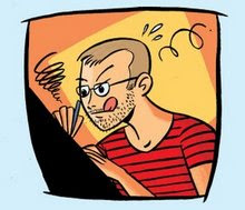
So this snapshot of me (taken a few weeks ago) inking an Emma & Sara page with cash everywhere doesn't exactly tell the truth anymore. Wish I was rolling in dough everyday, not just on pay day...


BTW: I've just looked at the new Raymond book by Tom Roberts over at Germunds place, and I can tell you that it looks just gorgeous! Loaded with rare art and photos. It's really a "must have"!
Me want it now...

And speaking of Raymond, here are two pieces I've found on microfilm. (Dunno if they are in the book or not.)

First a short bio from "The Bradford Era" June 27, 1946.

Then a teaser from "Waterloo Sunday Courier" March 10, 1946.
(I know the image is often reprinted but I hadn't seen the ad itself before.)

/Joakim.

Sunday 30 March 2008

March 30, 1940

Did you wake up this morning wondering what happened in the funnies this very day 68 years ago?
Wonder no more...

Patsy by Graff, Scorchy Smith by Frank Robbins and well just click on the pics and see for yourselves. Enjoy! :)

Saturday 29 March 2008

Wash Tubbs 1934

Ooops!
Remember the 1934 Roy Crane "Wash Tubbs" strip I mentioned yesterday. I spilled half my blueberry soup over the original while eating yesterday evening. The art is now a blue mess...
Fortunately I had a few snapshots taken before the disaster.
This should be a lesson to everybody: do not read your original art while eating. Terrible things can happen.

Anyway here are some "Before" pics... Nice, eh?


PS.
I was only kidding. The original is safe and I did *not* eat blueberry soup anywere close *any* piece of original art. I just wrote the above to upset my Crane obsessed friend Germund for a second. :)
I'm mean, ain't I?

Friday 28 March 2008

Work in progress


I've been working in the studio trying to finish Emma & Sara #175 today. I'm not the fastest artist around so it takes some time for me to finish a page. But now it's only one panel left. :)
Then I have to write the next one, draw that, write the next, draw that... Anyway, here's another soon to be finished panel from the same page:

Spent some time at work today coming up with a new logo for Rune Andréasson's "Lille Rikard". I guess you can see were I got my inspiration? Hint: Check your early issues of a particular Disney title when it was still a Four Color One-Shot comic. :)What the rest of the cover looks like must still be kept a secret. But look for it in color in Bamses Äventyr #16 out this summer.

I't Friday evening here in Sweden and I really should get something to eat before I starve to death. (The last thing I ate was two pizza slices for lunch...)
The more I think of it the hungrier I get. So I'd better head home now. Maybe I should read my original 1934 Roy Crane Wash Tubbs strip, that arrived in the mail a few days ago, while eating? Maybe I should stop bragging about it and just go home? Maybe so...

Thursday 27 March 2008

Ba-Ba


Ever heard of a swedish newspaper strip about a little black girl named Ba-Ba?
It was written and drawn by Sten Rinaldo and syndicated by himself from the 30's into the 50's.
The son of Sten Rinaldo contacted me and Svenskt Seriearkiv a while ago and we now have plans to do a book featuring the best of the strip. The family has lots of material in their posession but unfortunateley very few originals and the printed material mostly dates from early in the run.
So, that's were you can help.
Do you know where the strip was published?
Was it published in USA or other countries?
(We know that it was published in Finland and in an african country.)
Do you have tearsheets with the strip that we could borrow?
Or scans that we could get access to?
Or even original art?
Any help regarding finding material from the strips long run will be appreciated.

Here are some rather bad scans from a photo of some original Ba-Ba (or Baba) dailies. (The first pic in this post is taken from Seriewikin. Originally published in Stockholms-Tidningen 1951.)

Cartoonist photos

It's been a long time since I posted any cartoonist photos here on the blog. So for those of you who wants to see pics of some great comic artists from the past I hope you enjoy this post.

First we have Al Capp in a shot from Aug. 5, 1953:


Otto Soglow:

And then Ottos (not so little) Little King together with Jimmy Durante Aug 30, 1934.

Jimmy Swinnerton 1932:


Hal Foster at his drawingboard Feb 15, 1962:

And to end this post: Anyone who can name all four (or just one) of these cartoonist? A tough one, I know. Good luck! :)


PS. Myself I'm currently trying to dechiper Floyd Gottfredsons Mark O'Polo scripts. I just wish his handwriting was easier to understand...

Tuesday 25 March 2008

Peanuts original art

A friend of mine recently remembered that he bought a Charles Schulz Peanuts original back in the 70's. An early one, that is.
From 1954!
8-14, 1954 to be more precise.
The art is in excellent condition as can be seen on the scan. (The zip is still nice and gray.) So if anyone's interested and can give him a serious bid you can have a really nice Peanuts original on your wall. :)
Yep, he wants to sell it and I thought I should give you, the loyal blog reader, the opportunity to grab it before offering it on eBay or Heritage. (Click image to enlarge.)

If you have any questions or wants to give an offer, please send me a mail at sekvenskonst at telia.com

/Joakim.

Buck O'Rue


Got this message from Germund von Wowern regarding the Buck O'Rue book:
-------
Now I've compiled a list of all the Buck O'Rue artwork Richard Huemer and I are missing to complete the book. I'm making a last attempt to locate it through a few blogs, so if you could help us by posting a search plea we'd be exceptionally grateful. Practically the entire run Jan 15, 1951 to late 1952 is ready and scanned from black/white proofs and I have already spent much of last year cleaning up the artwork.

The year 1951 is 100% complete, so all the missing art is from 1952. We're only missing one single Sunday entirely (January 20, 1952), but would like to obtain the full 12-panel versions of the following:
Feb 3
May 4
June 8,15,22,29
July 6
August 10,17,24
December 14 and later, but these were probably never even produced.

The dailies are complete Jan 15, 1951 to July 19, 1952, except the week of July 7-12, 1952. These late dailies were probably never even published in newspapers at the time, but were most likely drawn.
-------

Anyone who can help Germund and Richard?

[Edit: a third page version of the January 20, 1952 sunday has been found. :) ]

Tuesday 18 March 2008

10 hour comic

A few weeks ago I attended a " make 10 pages in 10 hours comic jam".
Needless to say I didn't finish ten pages and neither did I stay for 10 hours... But it was fun to do something different than I usually do. And I had great company.
It was all done very quickly. Just blue pencil on ordinary thin paper and then inked on the very same paper with a Pentel brush pen. Unfinished, but still... it has cute mice in paracutes.
What more can you ask for? ;)
Here are some sample pages:


Sunday 16 March 2008

Torvald Gahlin


Have you ever dreamt about walking in to an antique store just to find a stack of original art among the old lamps, tables and used tin soliders? And the artwork then turns ot to be comic strip art from 1940? And by an artist you happen to like and never seen original art by before?
That happened to me two days ago. Not in a dream but for real. :)

The artwork seen here is from a strip named "Fredrik". Drawn ca. 1940 by swedish artist Torvald Gahlin (1910-2006). (One of the strips I bought is dated July 24, 1940.) He's most known for his "Salon Gahlin" in Dagens Nyheter and "Klotjohan" and he did "Fredrik" between 1934 and 1973 according tho sources on the net.
Anyone who knows for sure if it really ran all those years?

Judging from the samples in the stack there were some recurring characters besides Fredrik in the strip. Two small black birds and a mean wolf. The two samples below (wich I had to scan as two pieces each since they were too large for my A3 scanner) showcases all three.


Most of the jokes in the strip are pretty dated. Jokes about he war and local events in Gothenburg. But the two strips here will probably still be understood by everyone 68 years after they were made. I hope you enjoy them just as much as I do.
Finding them really made my day!

Anyone who knows what happened to the rest of Gahlins artwork?
Are there any "Klotjohan" strips out there?

Thursday 13 March 2008

Spring fashion


This is what to wear during the spring. :)
Model: Hedvig.
(Check out her Deviant art pages!
Link to the right under Artists - Swedish.)

/Joakim.
PS. I'll probably get spanked for putting this pic on the blog.
But that's a punishment I can take. ;)

Extra-PS.
There now are over 1000 different persons visiting this blog every month!!! I'm amazed. I hope you like what I post.
I'm currently thinking about sharing many of the great pieces I have in my large Bob Lubbers collection. I have lots of original art, proofs and tearsheets that I want to share with you. Stay tuned.

Wednesday 12 March 2008

Snabba Wille

Here's something I bet few of you have seen before. The cover to Lektyr 4, 1961 featuring what might be the first (some expert out there?) appearence of Lucky Luke in Sweden. Here he's called "Snabba Wille" and he's featured on a full page inside. Nice, eh? :)

Sunday 9 March 2008

E&S update

Here's an update from the Emma & Sara camp.
Hedvig has just done the first E&S page that she both wrote and pencilled. She's usually only doing the pencils so this will actually be her first script to see print!
Myself I always stick to my brushes and nibs but for this page I've thrown them all away and will ink it with ... oh, horror ... felt tip pens! Never thought I'd do that. Too modern for me I guess. ;) However, it goes much, much faster to ink this way, so that's a great advantage. Half of the page is finished and here's a sneak peek. Enjoy!


BTW: Here's something more classic. And something that I wish I could have afforded. A Charlie Chan strip by Alfred Andriola. Just look at all the beautiful ink that he poured over the drawing paper. :) I think Alex Toth once said that he got a daily from Andriola and given the inscription on this daily this might be the one! Lucky guy or gal who's got this one!

Thursday 6 March 2008

Early Gohs


In Sweden Rolf Gohs is known for his many covers to the Swedish Phantom comic book (Fantomen) and his "Mystiska 2:an". But did you know that he also did illustrations for magazines? The examples below was found many years ago when I as a kid found old magazines in deserted houses in the countryside. They are probably from the late 50's or early 60's. Dunno wich magazine thy are from. Lektyr?
Got a few more that I will post if there's interest. Enjoy!

Monday 3 March 2008

Russell in the review

Continuing to present some rare Russell Patterson artwork here's one I promised to post a while ago: A fine example of his work from Pictorial Review from 1949.


Do you have any Patterson artwork in your files that you want to share? Please let me know.
I'd love to see scans of stuff I've never seen and it would be fun to post them here also if possible. Knowing that some pieces are so rare that one person never can get a complete collection of his work, it would be great if some of you with rare stuff would like to share. Maybe we can all get some surprises and see stuff otherwise inaccessible.
My mail address is sekvenskonst /at/ telia.com
I'm looking forward to hear from you and I promise to share more from my private files if you do it too.
Deal? :)

The Good, the Bad and the Cover

There are some things that disturbs me more than other. They are not important and really, I shouldn't care about it. But I still do...
One of those things that I can't stand is when colorists fills every single space on a comic book cover with gradients.
Just like they just discovered the tool in Photoshop and thought they had to use it to make the coloring look "professional". Or, I dunno... Using the gradient tool or the airbrush tool too much makes it look the opposite instead - unprofessional. Here is one example of what I think is really bad coloring and one made by someone who really know what he or she is doing.
Incidentally they are from the same comic book Swedish "Kalle Anka & C:o" and published just one week apart.

First what I think is a terrible example.


Every single area has been airbrushed. What the colorist doesn't seem to understand is that he/she is working with two dimensional characters. They are made up with ink and paper with heavy black outlines. They are not three dimensional, like some Pixar characters.
Compare it to having a squirrel on your doorstep. One is cute but having a hundred makes them irritating and disturbing. Just like this cover.

Then compare it to the one below. Notice that the colors on Donald are completely flat. The colorist knows that the focus is on Donald and thus doesn't overwork him. The color works as a compliment to the drawing and doesn't try to steal the show by shouting out to the reader. Inistead the gradients and airbrush tool has been used so well that the effects are almost invisible. They are there and gives the art warmth and depth without beeing noticed. This is how these Photoshop effects should be used. A good example of a coloring job as opposite to the coloring in the first example. IMO.
(It should be noted that this critique is not about the Kalle Anka comic book specifically but about coloring covers in general.)

Any thoughts on this?