Tuesday, 31 May 2011

Eisenberg on demand

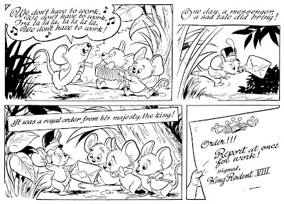
Back in 1952 Harvey Eisenberg, of Tom & Jerry fame, drew a story called "The Three Lazy Mice" for Western publishing. It's all written in verse and I get a Walt Kelly vibe from just looking at it. :)
Got it in glorious black and white, and if there's interest in seeing it I'll post it here on the blog.
Just let me know.

Sample half page from "The Three Lazy Mice", 1952.

Thursday, 26 May 2011

Miki Ma'oz #1

The department of odd comic books proudly present Miki Ma'oz!
This is issue issue no. 1. Published in Tel Aviv, 1947.


 It's currently up for auction and the description reads:
Illustrated booklet for children includes comic stories inspired by "Mickey Mouse", "Pinocchio" and "Donald Duck" [Danny Avazani] by Walt Disney. One of the first comics books published in Eretz Israel. [8]pp, 25cm.

Tuesday, 24 May 2011

Scooby-Doo artist identification

At work we pulled a set of 1970's stats from our Scooby-Doo shelves last week. And we plan to reprint some of the material in our pocket books later this year.
Now, the style of artwork looks familar to me.
Could this be Dan Spiegle? Maybe working together with another artist?
And does anybody know who wrote Scooby-Doo during the 70's?
If we can get the right credits we'd love to print the names of the creators in our books.


Update 1: Just found out that this story was printed in Scooby Doo Mystery comics #19 and one of the  other stories we have picked was taken from #30. We still don't know where the other two stories we have found were first published. (One about the treasure of Sierra Fantasma and one about a ghost on a river boat.) And the Grand Comics Database gives no credits for these issues.

Update 2: Thanks to Mark Evanier who could confirm that Dan Spiegle indees was the artist behind this story! :)

Saturday, 21 May 2011

"Scrooge is not part of painting"

Just watch this auction for:
Original Oil Orgin of "Another Rainbow"1968.
Enjoy!


 This is what the painting actually looks like ...


And while I'm at it:
One of the most unlikely team up pages I've ever seen. What's going on here and where was this published? Photo taken from eBay.

Tuesday, 17 May 2011

Sketches by Hedvig

Hedvig spent the weekend at my flat.
And as usual she left a trail of sketch paper behind her.
Like this one. Enjoy!


Sunday, 15 May 2011

Roy Crane goodies

Here's some "bonus stuff" for those of you who bought the Buz Sawyer book mentioned in the last post.

The drawing below is simply listed as "promotional art" in the book and reproduced sans the gray shading.
Actually this was used in the 1946 promotional book "Famous Artists and Writers of King Features Syndicate". The theme for the illustrations in the book was "the future" and we can find Snuffy Smith on the moon, a Don Flowers girl riding a rocket ship etc.
In that context it's easier to understand Crane's drawing. It shows what to expect from the new strip in the future.


We also find an illustration from the Cartoonists cook book out of context in the preface. Here it is complete with the menue and the reason why Buz is using chopsticks. Enjoy!


/Joakim.

PS. If the publisher wants these scans for publication I'd by happy to provide them.

Friday, 13 May 2011

Buz Sawyer review


Buz Sawyer - "The war in the Pacific" was released by Fantagraphics earlier this year.
Now, Roy Crane is one of my all time favorite comic strip artist and Fantagraphics is one of my favourite publishers. Crane is the master artist and storyteller and Fantagraphics have a great history of publishing fine books.
What could go wrong? Well, something obviously did here.

The first thing that made me worried about the project, even before the book was published, was that Rick Norwood was announced as the editor. He's probably a nice guy (I don't know him) but he's got a track record of reprinting classic strips in bad resolution taken from bad sources in his magazine "Comics Revue".
When the book was published I started to ask around if anyone who had actually seen the book could tell me what the reproduction quality was like.  The answers got me worried and I put off buying the book. But Roy Crane is Roy Crane and I knew someone at FB must have given the book thumbs up before it went to press so ... I picked it up.


The preface by Jeet Heer is really well written. (As is everything I've read by Jeet!)
But boy, am I glad I didn't sell my old Dragon Lady Press and Pioneer reprints!
The quality of the repinted strips varies a lot in this book. Most of them are muddy. Both as a result of bad source material (Guess it's because they didn't find a good set of strips where the bottom hadn't been cut. Many of the strips from this era comes in two formats where the cut version seems to be more common.) and too low resolution when scanned I guess.
On the other hand there are a few pages that looks as if they are scanned straight from proofs. Other seems to be scanned in high resolution but from bad sources.
I wonder if a combination of high quality cut strips and not so good full strips could have been possible? With someone in charge who knows his/her way with photoshop I guess that would have been the ideal way.

Here's a sample of what I mean. Just so you can see for yourself.
Left image taken from the old DLP edition and the right from the FB book.


You can see what the low res scanning has made with the lines in the background.

This panel also contains an odd piece of restoration. 
Top panel from the DLP edition and the bottom from the FB book.
Compare Sultry's torso in the two images. Ouch, she's been cut.

Another example of editing. Notice Buz' clothes where details dissappear in the new book. I wonder if the editor checked the old DLP editions at all when restoration was made?

 If you take another look at the images above you might notice something else too.
And this is an even more disturbing problem than using bad source material and low res scans, I think.
More on that below next sample.


Again we can see how much better reproduction can be.
About the problem I mentioned earlier. Can you see it in the images above?
Yes, the image has been "squashed". Probably to make the strip fit in neatly on the page instead of keeping the ratio. (Hard for me to explain this in english so it makes sense. But I hope most of you follow what I mean?)

Below we see the same images on thop of each other. The height is the same. (If you disregard that the left version is a short version.) As you can see the red/FB version is not as wide as the old version. Squash!


To sum things up: This could have been good, but it's not.
My suggestion is that FB stops this project before it goes too far, and that the editor and production team responsible for this mess is taken off the project. Then production can then resume when a team with knowledge on how to restore old comic strips has been found.

/Joakim.

PS. If proofs are needed, just ask and I'll try to help. Don't have access to the first years but large runs of late 40's and onwards.
Thursday, 5 May 2011

SPX 2011

[Edit: All of these books are now sold out. ]

Tomorrow I'll be heading to Stockholm together with Hedvig. Small Press Expo at Kulturhuset this weekend and we'll be selling newly printed stuff there.
Hope to see some of you there!

/J.

Wednesday, 4 May 2011

(The Unpublished) Barks Treasury pt. VI

 Barks fans Jörgen Malmsten and Patrick Fontaine both mailed me independently after I posted this drawing last week:


They supplied me with the image in color and after checking Peter Kyllings site I guess this actually is one of the 1996 - 97 drawings:
Misc 19 – "Every Man for himself".
If someone can confirm that would be nice.

First we have the image I got from Patrick:

And then the one I got from Jörgen:

As you can see they are quite similar but not the same. My guess is that the first is a preliminary version and the signed one is the finished piece.