


I actually prefer Egmonts coloring (too many gradients on this version) but it's nice to see without all the text and stuff covering the art. And the dutch version have so much more depth thanks to the smart desicion to not cover the end of the card tower.
She also sent me three more scans wich I thought you might enjoy. First we have a Daan Jippes cover wich wasn't used in Sweden. Though it was printed in Norway...

Then a nice Scamp cover by an unidentified artist. I really like when the artists are using black as a dominant color on a cover. And I miss having other characters than the ducks on the covers of the Donald Duck weekly in Scandinavia. Using Mickey, Goofy etc now and then gives some variation, you know.

And finally the cover of next weeks DD with artwork by Gerben Valkema. I just can't imagine how long time it must have taken to figure out how to fit all the characters together to do this image. :) Let's hope this will be used in Scandinavia too.

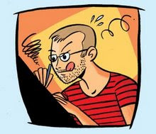
Henrieke also sent me the lemur drawing below! If you want to see more of her artwork you should visit her blog Ducks and Lemurs.


1 comment:
The Dutch text says "A happy new year from all of us, but what really baffles me is how the "eyes void" in the Donald sculpture ges a shadow...
Post a Comment