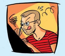
The first one was made yesterday with a nib on copying paper. No fancy tools or expensive paper here...

The second one is a comic I made for Malmö Högskola (Malmö University) earlier this year. (The script is not mine.) The original is quite large (A2) and it was inked with a W&N Series 7, #0 on a piece of good, old fashioned Schollerhammer 4G. I haven't seen it in print but I hope it turned out well...

Now, I'll have a cup of coffee and open that big package I got from Amazon.com :)


4 comments:
I remember seeing the last panel colored on this blog earlier.
Hmm, if this is supposed to work as a commercial, not directly aimed at regular comic-book geeks, I think you should have a more straightforward flow. Those arrows are mostly a bad solution.
And probably cut out that single panel with the guy and the question mark, too. It's distracting. Would be simpler if he had the question mark already when watching the reflection, I think...
I'm well aware of the things you mention.
But I got a layout from the writer and this is how he wanted it. IMO: When doing work for a client it's 100% better to do it their way. Then they get it exactly as they want it.
And I really don't see how those 14 panels would fit on the page if not layouted the way they are.
So, what to do...?
Ah, yeah. Well, I see.
Thanks for clarifying.
Post a Comment