


How to make scans and restorations good enough to be printed. (I'm thinking of IDW's and Fantagraphics books here.)
I'm about to scan a zillion of old "Barney Google" sundays from the 20's, a big file of Bob Lubbers' "Long Sam" etc and I want to do it right the first time around. :)
 |
| Panel from Long Sam 12-4, 1955. |
Update:
Did a test following Manuel's advice and I think I'm on the right way now!
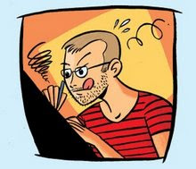
Thanks for the input all of you! Here's a sample panel from one of the pages I test scanned. The paper was very lightly yellowed and I think I got pretty close to the original when I scanned.
(Original is 400dpi, file size reduced for the blog.) Enjoy!


14 comments:
I much prefer the top image. In the early years of Cartoon Retro I spent hours "restoring" old art by removing the aged newsprint in Photoshop, and I regret it. At the same time, I was adding aged newsprint texture to my own digital art to give it warmth. Not very logical.
It drives me crazy now when I see great old sunday comics that have had the yellow sucked out. It just kills it. It doesn't just remove the yellowed newsprint, it sucks all the life out of the other colors, especially skin tones.
The recent book of Eisner's PS Magazine comics got it exactly right, as do Dan Nadel's recent books.
Craig Yoe's books suck all the yellow out- and then ADD newsprint texture over the top, which baffles me.
I think the goal should be to have the scan approximate as close as possible the experience of actually looking at the original strips.
S.
Good points! And I really agree about the way it's sucking the life out of the other colors.
Well, I'll probably just scan the sundays as good as I possibly can (saving them as 400dpi, tiff) and skip the restoration part for now.
I suggest keep saved the original scans in 600dpi.
After spending a lot of time looking at scans at the Digital Comics Museum, I've come to prefer the "raw" scans. The yellowish cast of the newsprint contributes greatly to the overall look of comics color.
That's why I dislike reprints where they shoot b&w proofs and overprint using the "original" colors (many Marvel reprint books were done this way). On the glaring white book paper the colors look ugly and garish.
Well, in my world the trick is to remove the yellowing caused by aging of the paper, while not affecting the printed yellows /reds. I agree that the experience of reading a reprint of Sunday pages ought to be the same as actually looking at the original strips, but if the material is from the 1940s, it should look as they did in the 1940s, not like the yellowed tearsheets look today. And that's a tough nut to crack.
My scanner (an A3 Mustek) permits me to scan color in two ways:
1 – you select the image including in your selection a portion of the black background of the scanner cover; result: the scan will have too much yellow, the yellow of the old newspaper, which means the scanner wants to preserve the real contrast between the newsprint paper and the background color.
2 – you select the image without including the black background of the scanner cover; then the image loose much of the yellow, which means the scanner reads the yellow of paper as simply paper, as simply any other white or almost white paper.
I select the option 2.
Choosing option 1, later we certainly, with Photoshop, can clean the yellow of the paper, but is not the same, for other colors will also lost intensity.
Another important thing: certain scanners (as mine) have the option to remove the tiny dots that certain colors are made of (for example: flesh color), compacting them so they turn indistinguishable. For me, is important don't do that. The tiny dots (Ben-day shading) are part of the old comics. It's possible they will be partially lost in some future process of restoration, but is important that the scans respect them.
About the DPI. I think 400% at 100% size is enough.
About scanning black and white daily strips: never scan as bitmap/lineart. Even if you scan at 1200 dpi, it’s a mistake. Always scan grayscale, 600 dpi, or 400 if the original are big.
Hope you understand my English.
This is a moot point in most cases, but if you have really good source material: Make a separate bitmap (binary B/W) scan for the lettering in the highest possible resolution (at least 800 dpi). Then if you print a book, sandwich two separate images, one rasterized with the images and one line art (unscreened) with the lettering. Unfortunately most editors these days are too uneducated in their craft to figure out that you should never, ever screen lettering or line art. (In the recent Rip Kirby collections line art is screened even though they have access to syndicate proofs - stats - for a lot of the strips. Ahrrgh.)
I have a huge amount of Long Sam's waiting to be scanned as well, from all periods. What are you doing yours for? Do you want to know if I have dates you are missing, can you give me you dates so I don;t spend the time scanning them if they are going to turn up somewhere else?
Good point, Manuel. I'll try that. I have the Mostek as well, but some editors I work with complain that there isn't a descreening function, because that can result in a moire effect. So do we have the same machine and why doesn your have this blurring function?
No, Ger, what I'm telling is that my scanner DOES HAVE the blurring function.
Joakim, the Robin Malone color panel is absolutly wonderfull in big size. Better than ant work by Lichtenstein!
Ger: I don't use the de-screening effect. Let the printer use stocastic printing and that will take care of the problem. No moire effects to be seen in any of the books printed by Egmont that uses stochastic printing. (And the screen tones are preserved!)
I realised that all of the Long Sams I have are thirds or tabloids. So I'll wait with scanning. No need to scan incomplete stuff. There are loads of half pages up for sale on eBay now. I'll go for them. If any blog reader is going for them too, let me know and we don't have to fight about them. Lets share/trade scans. :)
( Mail me at:
sekvenskonst at telia.com )
The stuff I scan is not for any particular project. But if any publisher wants to use them in the future I'll be happy to help out with scans. Just want to see this good stuff preserved. :)
Manuel:
Lubbers is better than a 1000 Lichtensteins! :)
Is this the same dealer that also sells Robin Malones? I was going to bid as well, but backed off because this dealer has a only shipping to the US sign up...?
Manuel - I mistyped and meant why doesn't mine? Nut I guess it's the blurring function and not called descreening...
Post a Comment