


One of those things that I can't stand is when colorists fills every single space on a comic book cover with gradients.
Just like they just discovered the tool in Photoshop and thought they had to use it to make the coloring look "professional". Or, I dunno... Using the gradient tool or the airbrush tool too much makes it look the opposite instead - unprofessional. Here is one example of what I think is really bad coloring and one made by someone who really know what he or she is doing.
Incidentally they are from the same comic book Swedish "Kalle Anka & C:o" and published just one week apart.
First what I think is a terrible example.

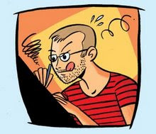
Every single area has been airbrushed. What the colorist doesn't seem to understand is that he/she is working with two dimensional characters. They are made up with ink and paper with heavy black outlines. They are not three dimensional, like some Pixar characters.
Compare it to having a squirrel on your doorstep. One is cute but having a hundred makes them irritating and disturbing. Just like this cover.
Then compare it to the one below.
 Notice that the colors on Donald are completely flat. The colorist knows that the focus is on Donald and thus doesn't overwork him. The color works as a compliment to the drawing and doesn't try to steal the show by shouting out to the reader. Inistead the gradients and airbrush tool has been used so well that the effects are almost invisible. They are there and gives the art warmth and depth without beeing noticed. This is how these Photoshop effects should be used. A good example of a coloring job as opposite to the coloring in the first example. IMO.
(It should be noted that this critique is not about the Kalle Anka comic book specifically but about coloring covers in general.)
Any thoughts on this?

2 comments:
Very, very ,very good post!!!
I think the same opinion.
Maybe a little disturbing to see a chin saw used as a household appliance...but that's OT. :-)
I see your point about the gradient effects.
Post a Comment